Your phone is the one thing you carry from coffee runs to concerts to that one-too-many Zoom calls—so if your case looks like an afterthought, it kind of drags your whole vibe with it. A great pattern fixes that fast. It turns “just protection” into something that feels like you, while still keeping your camera bump, corners, and screen edges out of danger.
Below are phone case pattern ideas that look good in real life (not just in a perfectly lit product photo), plus how to choose patterns that stay crisp, match your everyday fits, and don’t get visually annoying after a week.
What makes a pattern look expensive (even if it isn’t)
A pattern doesn’t need to be complicated to look premium. The difference usually comes down to two things: repeat and restraint. A clean repeat (where the spacing is consistent) reads intentional. Restraint is knowing when to keep the palette tight, or when to let one “loud” element be the star.There’s also the practical side. High-contrast patterns can make scuffs less obvious, while super light patterns can show grime faster if you’re always tossing your phone in a bag with keys. If you use MagSafe accessories, patterns that are too busy right where the magnet ring sits can look chaotic when you snap on a wallet or power bank—so it helps to consider where the visual “quiet zone” should be.
Phone case pattern ideas by aesthetic
Some patterns are instant classics; others are pure main-character energy. The best move is picking a pattern that matches how you actually dress and what you want your phone to say when it’s on the table.1) Checkerboard, but make it personal
Checkerboard is iconic for a reason: it reads graphic, modern, and a little rebellious. You can keep it black-and-white for a clean streetwear vibe, go pastel for soft-girl energy, or flip into neon for nightlife. Smaller checks look more refined; bigger checks feel more playful and bold.2) Micro florals that don’t feel “grandma”
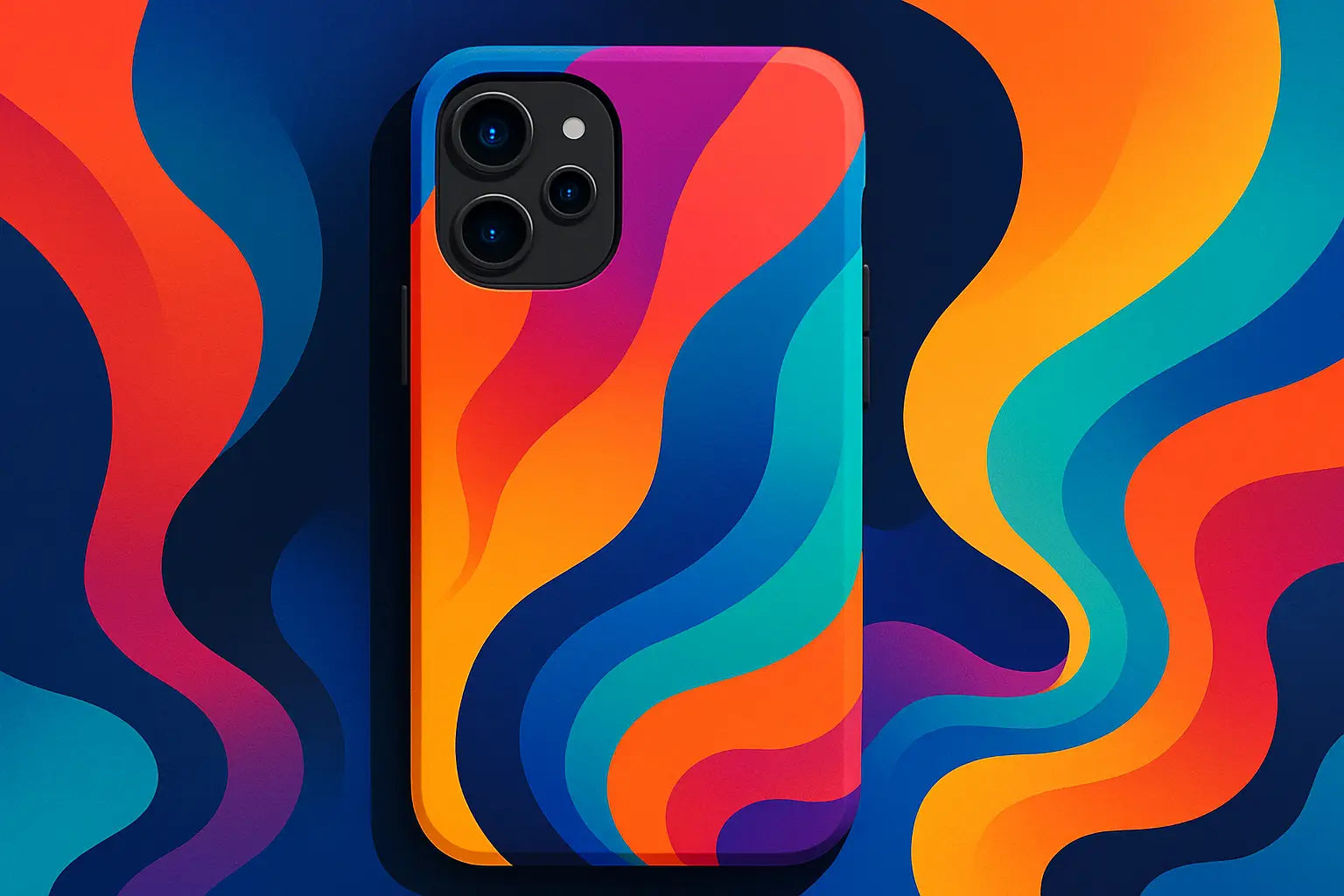
Florals can be cool when they’re scaled down and styled right. Micro daisies, tiny wildflower sketches, or minimalist tulip repeats feel fresh and wearable. If you want it to stay modern, look for simple linework or a limited palette (two or three colors max).3) Abstract swirls for “art kid” confidence
Swirl patterns—think wavy lines, marbled ribbons, or liquid shapes—hit that sweet spot between fun and wearable. They also hide fingerprints and tiny scratches better than flat solids. If you’re unsure about going bold, start with neutrals (tan, cream, black) in a swirl layout.4) Y2K hearts that aren’t too sugary
Hearts don’t have to be cutesy. Try tiny scattered hearts, outlined hearts, or a glossy heart “sticker” look. A black base with red or pink hearts reads more fashion than Valentine’s Day.5) Camouflage with a twist
Classic camo is always in rotation, but modern camo gets interesting when the colors shift. Sage and sand feels outdoorsy-cool; purple or blue camo looks futuristic. Camo is also forgiving—if you’re hard on your phone, it won’t show wear as quickly.6) Animal print that actually matches outfits
Leopard and zebra are the obvious picks, but tortoise, cow print, and snake scales are having a moment too. The trick is choosing a base color that plays nicely with your wardrobe. If you live in black jeans and sneakers, a neutral animal print becomes a “goes with everything” pattern instead of a statement you can’t repeat.7) Plaid for cozy-but-put-together energy
Plaid is the pattern version of a good jacket: it makes you look like you planned the look. Go traditional (reds, greens), soft neutral plaid, or pastel for a lighter vibe. Tight, thin plaid lines feel more polished; chunky plaid feels more casual.8) Terrazzo speckles for modern minimalists
Terrazzo is basically confetti for people who hate confetti. The scattered chips give visual texture without being loud. It’s also a smart option if you like patterns but don’t want a theme.9) Gradient ombré that looks clean on camera
A smooth gradient (black to gray, pink to orange, blue to purple) is a pattern that behaves. It adds interest without fighting your lock screen wallpaper. If you’re always taking mirror selfies, gradients tend to look sleek instead of distracting.10) Star maps and cosmic prints
If you want a pattern that feels a little magical but still grown, go celestial: tiny stars, constellations, moons, or a subtle galaxy fade. Dark bases (navy, black) look dramatic; lighter bases feel dreamy and soft.11) Geometric lines for a sharp, techy look
Clean geometry—diagonal stripes, grids, triangles—gives a phone case a modern edge. This is a great lane if you want “stylish” without being cute. It also pairs really well with minimalist outfits and sleek accessories.12) Sticker-bomb chaos (the controlled kind)
Sticker-bomb patterns look like you covered your phone in your personality: little icons, slogans, doodles, and random mini graphics. The key is density. A packed layout reads intentional; a sparse sticker layout can look unfinished.13) Bandana and paisley for vintage heat
Paisley feels bold, confident, and slightly nostalgic. Bandana prints in black, navy, red, or pink bring instant attitude. They’re also surprisingly versatile—especially if your closet leans denim, leather, or oversized hoodies.14) “Scribble” line art for effortless cool
Loose doodles, hand-drawn faces, abstract sketches, or messy brush strokes look creative without trying too hard. These patterns are perfect if you want something artsy that still feels neutral.15) Marble, but not the cliché kind
Marble can look ultra clean—if it’s done with intention. Skip the overly gray, high-gloss “countertop” look and go for colored marble (green, blue, blush) or a softer, cloudy marble that feels more editorial.16) Fruit prints that aren’t childish
Cherries, citrus slices, strawberries, even tiny olives—fruit prints can be playful and still look stylish when the scale is small and the colors are slightly muted. Pair them with a simple background so it doesn’t turn into a cartoon.17) Monochrome texture patterns
Not every pattern has to be “graphic.” Monochrome textures—like subtle dot matrices, embossed-looking waves, or tone-on-tone stripes—are low-key but still interesting. These are perfect if you want something you won’t get tired of.How to choose the right pattern for your phone (without overthinking it)
Patterns aren’t just about taste; they’re about how you use your phone.If you’re always holding iced coffee and your phone at the same time, high-contrast or darker patterns tend to stay looking fresher. If your phone lives in your gym bag, a busier pattern can disguise the little everyday wear that happens.
Also think about your lock screen. If your wallpaper is already chaotic, a calmer case pattern will make the whole look feel more intentional. If your wallpaper is minimalist, that’s when you can let the case go louder.
Make the pattern work with accessories (especially MagSafe)
A lot of people forget the case isn’t the final look—the accessories are part of the outfit. If you use a MagSafe wallet, ring holder, or power bank, you’re basically layering design on top of design.Here’s the trade-off: bold all-over patterns look amazing on their own, but can clash when you attach another piece with its own color and shape. If you swap accessories often, consider patterns with a visual center or a slightly calmer area where the accessory sits.
If you’re the “one case, one wallet, same combo every day” type, go ahead and build a full set that looks intentional. CASETEROID leans into exactly that mix of bold design and functionality (including MagSafe compatibility) if you want a case that feels like an accessory, not a compromise: https://caseteroid.com.
Pattern placement tips that change everything
Where the pattern sits matters more than most people realize. If the most detailed part of your pattern lands right under your fingers, it can look busy fast—especially in photos. Patterns that frame the edges or create a subtle “border” around the camera area tend to look more premium.Scale matters too. Small repeats feel refined and “designer-coded,” while oversized repeats are louder and more playful. If you have a larger phone (like a Pro Max or Ultra), oversized patterns have more room to breathe; tiny patterns can sometimes look like visual noise from a distance.
A quick reality check: trends vs. timeless
If you love changing cases with your mood, chase trends. Go sticker-bomb, neon gradients, or hyper-saturated swirls and enjoy the moment.If you want one case to live on your phone for months, aim for patterns that don’t fight everything you wear: monochrome textures, terrazzo, clean plaid, or a neutral animal print. Timeless doesn’t mean boring—it just means you won’t wake up one day and feel like your phone is wearing an outfit you outgrew.
Pick a pattern that makes you want to set your phone down face-up, not hide it screen-side down—because that’s usually the sign you found the one.
Eco-Friendly Phone Cases That Don’t Look Boring
Phone Case Materials: What Really Changes