
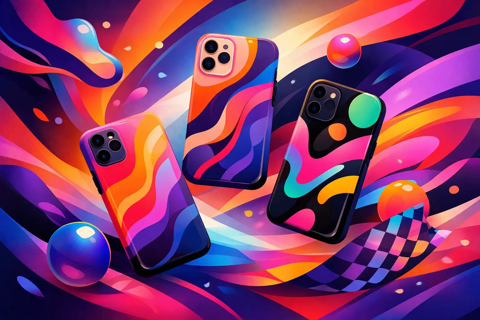
A plain phone case says, "I needed something fast." A great one says, "Yes, I care how this looks - and yes, I still want my phone protected." That tension is exactly why phone case design trends for Gen Z keep moving so fast. This crowd wants self-expression, clean functionality, and enough durability to survive a drop on concrete, a packed tote, or a rushed commute.
What makes Gen Z style different is that it rarely sticks to one lane. A case can be playful and polished, minimal and loud, nostalgic and futuristic. The best designs do not just follow a color of the month. They fit how people actually use their phones every day - for content, for payments, for photos, for texting, and for showing a little personality without saying a word.
What phone case design trends for Gen Z look like now
The strongest trend right now is not one look. It is range. Gen Z buyers are curating their tech accessories the same way they curate outfits, playlists, and home screens. That means there is room for soft neutrals, graphic prints, glossy finishes, and utility details, as long as the final result feels intentional.
There is also less patience for accessories that look good online but disappoint in real life. A trendy case still has to feel sturdy in hand, fit well, and work with everyday add-ons like MagSafe chargers, grips, straps, or power banks. Style gets attention, but usability closes the deal.
1. Bold graphics are replacing safe basics
Solid black and clear cases still have a place, but they are no longer the default for style-first shoppers. Gen Z is leaning toward designs with more attitude - abstract shapes, illustrated motifs, punchy typography, checker patterns, flames, stars, mixed color blocking, and prints that feel pulled from fashion rather than generic tech.
The appeal is obvious. A graphic case turns a phone into an accessory, not just a device. It can pull an outfit together or add contrast to a simple look. It also photographs better, which matters when your phone shows up in mirror selfies, desk shots, and quick content clips.
That said, there is a trade-off. The louder the design, the faster it can feel tied to a moment. If you switch aesthetics often, bold graphics are fun. If you want a case that works for six months straight, choose prints with some flexibility in the color palette.
2. Minimalism is still in - but warmer and more tactile
Minimalist cases are not going anywhere, but the vibe has changed. Instead of cold, flat, ultra-basic designs, Gen Z is favoring softer neutrals, muted tones, creamy finishes, and subtle texture. Think sand, sage, butter yellow, smoky gray, faded pink, and off-white instead of harsh monochrome.
This style works because it feels elevated without trying too hard. It is clean, but not sterile. It pairs well with everything, and it gives the phone a more premium look even when the design itself is simple.
Texture matters here. Matte coatings, soft-touch finishes, and grippy materials make minimal cases feel more considered. A smooth case may look sleek, but if it slides off a desk or feels slippery in hand, that clean aesthetic gets old fast.
3. Nostalgia is still driving design choices
Y2K influence has not disappeared. If anything, it has become more refined. Gen Z still loves playful references to early 2000s culture, but the best versions feel edited rather than costume-like. You see this in chrome effects, retro florals, smiley motifs, sticker-style artwork, candy colors, and tiny details that feel familiar without looking dated.
This trend works especially well in phone accessories because nostalgia naturally fits small-format design. A case can carry a fun throwback print or glossy finish without overwhelming your whole look.
The trick is balance. Too many references at once can push a design into novelty territory. A single retro cue often lands better than trying to stack every trend from one era into one product.
4. Personalized energy matters, even without full customization
Gen Z likes products that feel specific. That does not always mean adding a monogram or uploading a custom image. Often, it means choosing designs that signal a certain mood, niche, or identity. A case can feel personal because it matches someone’s style language - artsy, sporty, polished, chaotic, romantic, or low-key.
This is why trend-forward collections tend to do well when they offer variety without becoming random. Shoppers want options that feel distinct enough to express something. They do not want ten cases that are technically different but visually say the same thing.
Brands that understand this create designs with clear personalities. That is a big reason statement cases keep growing. They give people a quick way to make their phone feel like theirs.
5. Utility details are part of the design now
One of the biggest shifts in phone case design trends for Gen Z is that functional features are no longer hidden. MagSafe compatibility, ring holders, wrist straps, crossbody options, raised edges, and camera protection are becoming part of the visual appeal instead of looking like technical add-ons.
That change makes sense. Gen Z expects convenience, but they do not want their accessories to look clunky. If a case supports magnetic charging and still looks slim, that matters. If a strap actually complements the color story instead of feeling purely practical, even better.
This is where design gets more interesting. The best utility-driven cases do not force a choice between fashion and function. They treat grip, charging support, and daily carry as part of the overall aesthetic. CASETEROID sits in a strong lane here because the sweet spot is exactly that mix - bold visual identity with features people actually use.
6. Camera-first design is influencing case shapes
People use their phones as their main camera, so it is no surprise that case design is adapting around that reality. Gen Z notices whether a case frames the camera cleanly, protects the lens area properly, and still keeps the phone looking sleek from the back.
This has led to more intentional camera cutout styling, raised bezels that feel integrated instead of bulky, and layouts that make the back of the phone look balanced. Since the camera area is so visually dominant on newer devices, it can make or break the whole design.
A case might have a great print, but if the camera section looks awkward, the overall effect falls apart. On the other hand, a well-designed camera surround can make even a simple case feel expensive.
7. Gloss, shine, and contrast finishes are back
After years of matte everything, shine is having a moment again. Glossy finishes, reflective accents, translucent layers, and contrast between matte and polished surfaces are all showing up in trend-forward cases. The appeal is movement. These finishes catch light, add dimension, and make a phone feel more styled.
For Gen Z, that matters because accessories are often seen on camera. A case that reflects light in an interesting way can stand out more in photos and video than a flat finish.
There is one obvious downside. Glossy surfaces can show fingerprints and small scratches more easily. For some people, the visual payoff is worth it. For others, a mixed finish - where shine is used in specific accents rather than across the whole case - is the smarter choice.
8. Coordinated accessories are becoming the full look
The phone case is no longer the only star. Gen Z increasingly likes a matched setup - case, AirPods case, power bank, ring holder, or strap in a coordinated style. It feels more polished and a little more fashion-forward, like building a small accessory ecosystem instead of buying one random item.
This trend is especially strong with people who care about visual consistency in everyday carry. Matching does not have to mean identical. Sometimes the strongest combinations use the same palette or motif across different accessories while keeping each piece slightly different.
That approach feels fresher than a perfect set. It looks curated, not forced.
What actually makes a trend worth buying
Not every trend deserves a spot in your cart. The best case designs do three things well: they match your style, they fit your routine, and they still feel good after the novelty wears off. That last part matters more than people admit.
If you use MagSafe every day, a case without strong magnetic support will get annoying. If you drop your phone often, ultra-thin designs may not be worth the risk no matter how good they look. If you get bored quickly, rotating between a few affordable statement cases can make more sense than searching for one perfect forever option.
That is really the core of Gen Z taste in tech accessories. It is expressive, but not careless. Trend-aware, but not blindly loyal to whatever is loudest online. People want design that feels current, but they also want value, durability, and details that make daily life easier.
The smartest phone case is not the one screaming for attention from across the room. It is the one you still love pulling out of your pocket a month later - because it looks like you, works like it should, and makes an everyday object feel a little more fun.
MagSafe Power Bank Charging Speed Test
How to Make MagSafe Grip Work Better