
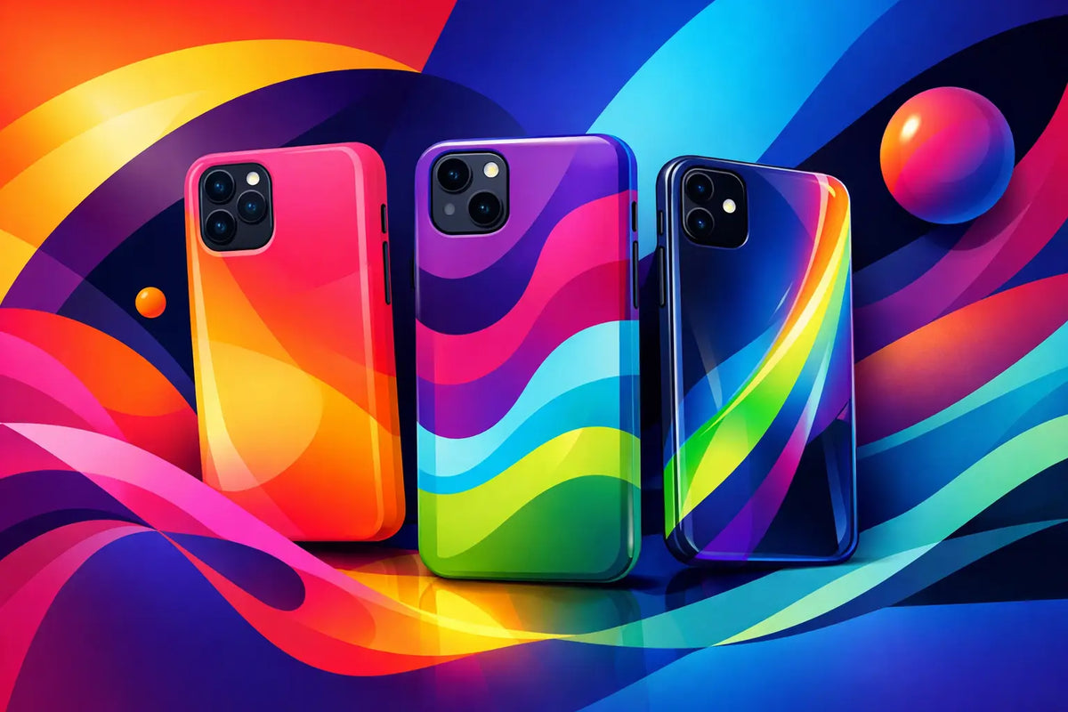
Your phone is already in every mirror selfie, coffee run photo, desk setup, and group-chat video. The case around it is not a background detail anymore. This year’s phone case color trends are all about choosing shades with enough personality to be noticed, while still working with the outfits, accessories, and tech you use every day.
The biggest shift is simple: people are moving past safe, forgettable colors. That does not mean every case needs to be neon. It means the color should feel intentional. A deep espresso case can look just as fashion-forward as a bright cherry red one when it matches your style and the finish gives it dimension.
Phone Case Color Trends: Rich, Bright, and Personal
The strongest colors right now fall into a few distinct moods. Warm neutrals make a phone look polished. Saturated reds and blues bring energy. Soft, slightly faded pastels give off a more personal, collected feel than the ultra-sweet shades of a few years ago. The common thread is depth. Flat colors still have a place, but colors with warmth, undertones, or texture tend to look more expensive and more wearable.
A good phone case color does more than follow a seasonal palette. It should make sense with how you actually live. If your phone is usually next to a black laptop, silver jewelry, and neutral sneakers, a cool gray or dark green case may get more use than a loud print. If your closet is full of denim, white tees, and simple silhouettes, a high-impact case can do the styling work for you.
Espresso, Mocha, and Other Elevated Browns
Brown is having a serious moment because it gives the same versatility as black without feeling expected. Espresso, cocoa, chestnut, caramel, and taupe pair naturally with gold hardware, cream outfits, denim, and darker fall layers. They also make clear, black, or titanium phones look warmer and more styled.
The trade-off is that a very pale beige case can show dye transfer and everyday marks faster, especially if it lives in the same pocket as dark jeans. If low-maintenance is the goal, choose a deeper brown, a patterned design, or a textured finish that hides small signs of wear better.
Cherry Red and Deep Wine
Red has moved away from basic fire-engine brightness and into richer territory. Cherry red looks crisp and playful, while burgundy, oxblood, and dark wine bring a more dramatic edge. These colors feel especially good on a phone case because they are bold without taking over an entire outfit.
A glossy red case makes a clean, high-shine statement. A matte wine shade feels moodier and more understated. Neither is universally better. Gloss catches attention and can show fingerprints; matte softens the look and usually feels more grippy in hand.
Cobalt, Navy, and Electric Blue
Blue is the answer for anyone who wants color without going overly sweet or overly loud. Navy is dependable, cobalt is graphic, and electric blue has the kind of energy that stands out against black, white, and metallic phones. It also plays well with both silver and gold accessories, which makes it easier to work into a mixed-metal everyday look.
For a more premium feel, look for blue paired with a translucent edge, a marble effect, or a sharp contrast detail. A solid cobalt case is great when you want a clean pop. A blue design with layers and texture is better when your phone case is meant to be the main accessory.
Butter Yellow and Soft Citrus
Yellow is no longer just a summer-only choice. Butter yellow, muted lemon, and creamy citrus shades bring lightness without the highlighter effect of neon. They look fresh next to white earbuds, clear accessories, and silver phones, and they add a little brightness to darker seasonal wardrobes.
This is one trend where the exact undertone matters. A buttery yellow feels relaxed and vintage-inspired. A sharper lemon reads more sporty and youthful. If you want something that will still work months from now, lean toward a softened yellow with a warm base rather than a super-bright fluorescent shade.
Dusty Pink, Lilac, and Soft Blue
Pastels are back, but they are less candy-coated this time around. Think dusty rose instead of bubblegum pink, muted lilac instead of bright purple, and powder blue instead of icy aqua. These tones look considered, especially when paired with a subtle graphic, a translucent finish, or a small chrome accent.
Soft colors can also balance the larger look of a Pro Max or Galaxy Ultra device. On a bigger phone, a dark case can sometimes feel visually heavy. A muted pastel keeps the device looking lighter while still adding protection and personality.
Clear Cases Get a Color Upgrade
Clear cases are not going anywhere, but plain transparency is not the whole story. Tinted clear finishes, colored bumpers, iridescent details, and printed graphics let the phone’s original color show through while making it feel less generic. This is a smart route when you love your device’s finish but still want it to look like yours.
A smoky clear case has a clean, futuristic look and is more forgiving than fully transparent plastic when it comes to tiny dust specks. A pink, blue, or amber tint gives the phone a new mood without fully covering it. For MagSafe users, a visible magnetic ring can be part of the design too, especially when it is framed in a contrasting color or integrated into a graphic.
Keep in mind that clear materials can yellow over time depending on the material, sun exposure, and how much wear the case takes. That is not a reason to skip clear completely. It is a reason to choose a quality case and decide whether you prefer crystal clear, smoky transparent, or a tinted option that is naturally less likely to show age.
Metallic Details Are Replacing Full Metallic Cases
Full chrome can be fun, but it is not the easiest finish to keep looking pristine. The more current approach is using metallic details with a grounded base: silver stars on navy, chrome accents on black, gold lines over brown, or a pearly border around a translucent case. You get the flash without turning your phone into a mirror.
This is especially useful if your personal style changes from day to night. A neutral case with a metallic detail looks right at a casual lunch, then still works when you are dressed up. It is one of the easiest ways to make a protective case feel like jewelry for your phone.
How to Choose a Trend Color You Will Actually Keep Using
Start with your everyday palette, not the color currently filling your feed. Look at the bag you carry most, the metal of your jewelry, the shoes you reach for, and the color of your headphones or laptop. Your phone case does not have to match every item, but it should not fight all of them either.
Then decide what job the case needs to do. A black, brown, navy, or smoky clear case is a strong daily driver if you want flexibility. Cherry red, cobalt, bright yellow, and graphic designs are better when you want your phone to add energy to a simple look. If you swap cases often, you can have both: one neutral for workdays and one statement color for weekends, travel, or nights out.
Also consider the phone itself. A bright case can make a black device feel less severe. A dark case can give a light-colored phone more contrast. With foldable phones, color has even more visual impact because the case is visible in multiple positions and becomes part of the device’s silhouette.
Make Color Work With Protection
The best-looking color is not much use if the case is slick, loose, or incompatible with the accessories you rely on. Check for raised edges around the camera and screen, a secure fit, responsive button coverage, and MagSafe compatibility if you charge or use mounts magnetically. Color should not force you to compromise on the basics.
At CASETEROID, that balance is the point: expressive designs, durable materials, and options that keep up with the way your phone gets used. A strong shade, a graphic finish, or a tinted clear look should still feel dependable when it is tossed into a tote, clipped to a strap, or snapped onto a charger.
Pick the color that makes you want to reach for your phone, then give it the protection to handle everywhere it goes.
Guide to Phone Case Protection Ratings Explained
Phone Case Warranty and Returns Policy Explained